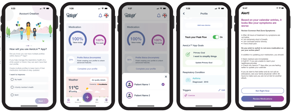
 |
 |
Based on your language, we suggest to change your settings to: En fonction de votre langue, nous vous suggérons de modifier vos paramètres comme suit :
Yes, that's correct Oui, c'est correct.In recent years, the field of mobile health (mHealth) has experienced a rapid expansion, with a wide array of mobile applications catering to various health and wellness needs. These applications hold immense potential to transform healthcare, empowering individuals to actively participate in their treatment and well-being.
However, poor design features, such as complicated navigation and screen presentations are not accepted by users in real-world settings1 and as a result can hinder engagement and adherence to recommended treatments.2 Similarly, features that promote usability and personalization are associated with increased use of mHealth apps.3,4,5
Therefore, evaluating the usability of mHealth applications becomes paramount to ensure their efficacy in promoting positive health outcomes. To address this crucial aspect, researchers and experts have developed evaluation tools, such as the NODE.Health (Network for Digital Evidence)6 and mHealth App Usability Questionnaire (MAUQ).7 These tools allow developers to obtain valuable insights into the strengths and weaknesses of an mHealth application, enabling them to make informed decisions for improvement and optimization.
Given that this was the first iteration of evaluating the application, the survey was focused on those elements of NODE. Health and MAUQ that were related to Design - follows familiar user-centered design patterns and is easy to use and Value - provides efficiency and value for users.
Acceptances were received from 11 HCPs (nurse, respiratory therapist and physician) and 12 patients (10 asthma, 2 COPD). The HCPs were asked to evaluate the app through the lens of the how their patients might respond. Given sufficient responses a statistical approach such as SPSS Exploratory Factor Analysis (EFA) can be used to assess each of the questions.8 However, given the early nature of this investigation we set arbitrary limits where, if 30% or more responses indicated they ‘Strongly Disagreed’ or ‘Disagreed” with a particular question, we deemed those aspects to require further investigation and look to improve those elements of the application.
 |
 |
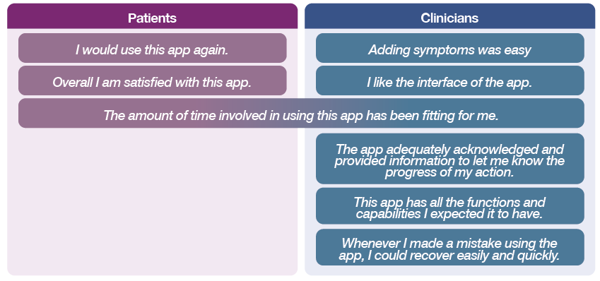
Of the 15 questions asked approximately 2/3 received overall positive responses (Neither Agree nor Disagree/Agree/Strongly Agree). The following questions were identified as requirement more investigation for our next iteration:
 |
To determine how best to eliminate the identified gaps, HCPs were assembled as an advisory board where follow-up questions based on survey results could be asked to gain a consensus. For patients, where possible, phone calls were arranged to discuss their feedback. From both groups, written comments from the survey were used for direction on how to improve and add more value to the user experience.
It was identified that priority development should be given to changes that reduce the time a user needs to spend on the app to complete a task.
One of the limitations in conducting this survey was that the app is also intended (in the future) to form the basis of a companion to a piece of connected technology (i.e. smart dose counter, smart valved holding chamber etc.). Without the accompanying tactile experience, some aspects of the questionnaire resulted in comments that the app is not “useful enough yet”. From further discussions participants described that the app needed to tell the patient something “they don’t already know”, therefore, additional features that prioritize a “so-what” outcome are necessary.
The strength of the study is that we have outlined a systematic approach to ensure that the application is created with the user at the center of the experience. The greatest limitation of this work is that it is still in the early stages with few respondents and an identified need to incorporate a tangible connection to their actual therapy / treatment. Future work will also need to expand the questionnaire to encompass other aspects of the NODE.Health and MAUQ that evaluate data control (privacy, control and security of data) as well as functional performance, such that tasks are executed quickly and accurately without impeding the user.
Developing a mobile health application using validated survey frameworks provides a systematic and user-centric approach that can help address the needs, desires, and expectations of patients. Developers can create an application that enhances disease management, improve patient outcomes, and promote self-care. In this case, the survey enabled the identification of a number of priority areas which were able to be followed up with patients and HCPs with the intent of making further improvements.
1 Ting, Y. L. (2012). The pitfalls of mobile devices in learning: A different view and implications for pedagogical design. Journal of Educational Computing Research, 46(2), 119-134. 2 Guertler D, Vandelanotte C, Kirwan M, Duncan MJ. Engagement and Nonusage Attrition With a Free Physical Activity Promotion Program: The Case of 10,000 Steps Australia. J Med Internet Res. 2015;17(7):e176 3 Angelini S, Alicastro G, Dionisi S, Di Muzio M. Structure and characteristics of diabetes self-management applications: a systematic review of the literature. Comput Inform Nurs. 2019 Jul;37(7):340–8 4 Fu H, McMahon SK, Gross CR, Adam TJ, Wyman JF. Usability and clinical efficacy of diabetes mobile applications for adults with type 2 diabetes: a systematic review. Diabetes Res Clin Pract. 2017 Sep;131:70–81 5 Kosa SD, Monize J, D’Souza M, Joshi A, Philip K, Reza S, Samra S, Serrago B, Thabane L, Gafni A, Lok CE. Nutritional mobile applications for CKD patients: systematic review. Kidney Int Rep. 2019 Mar;4(3):399–407 6 NODE Health. NODE Health knowledge center. http://www.nodehealth.org/knowledge-center/. Accessed June 2023. 7 Zhou L, The mHealth App Usability Questionnaire (MAUQ): Development and Validation Study JMIR Mhealth Uhealth 2019;7(4):e11500 8 Djamasbi, MUX: development of a holistic mobile user experience instrument.2017
Development of a Prototype Patient Respiratory Management Mobile Health Application Using Validated Tools to Assess User ExperienceDownload Poster